


Responsive vs Adaptive Web Design
| Responsive | Adaptive |
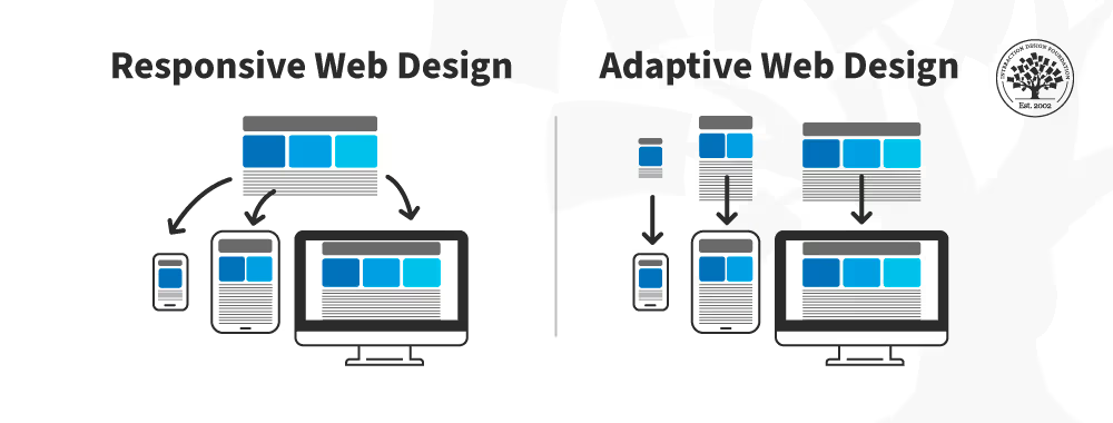
| Responsive Web Design (RWD) is the approach that suggests that design and development should respond to the user’s behavior and environment based on screen size, platform, and orientation. | Adaptive web design (AWD) is a tailored approach to creating online experiences. It’s a method that crafts fixed layouts that cater to specific device types, creating a highly optimized and device-specific user experience. |
| Responsive design, refers to the fluid approach of crafting sites to provide an optimal viewing experience — easy reading and navigation with minimal resizing, panning, and scrolling — across a wide range of devices. | Adaptive design, on the other hand, is a strategy that serves different devices with distinct layouts, using a detection method to deliver the appropriate version. |
Responsive example CSS :
body {
  font: 600 14px/24px "Open Sans", "HelveticaNeue-Light", "Helvetica Neue Light", "Helvetica Neue", Helvetica, Arial, "Lucida Grande", Sans-Serif;
  }
h1 {
  color: #9799a7; font-size: 14px; font-weight: bold; margin-bottom: 6px; }
.container:before, .container:after { content: ""; display: table; }
.container:after { clear: both; }
.container { background: #eaeaed; margin-bottom: 24px; *zoom: 1; }
.container-75 { width: 75%; }
.container-50 { margin-bottom: 0; width: 50%; }
.container, section, aside { border-radius: 6px; } section, aside { background: #2db34a; color: #fff; margin: 1.858736059%; padding: 20px 0; text-align: center; } section { float: left; width: 63.197026%; } aside { float: right; width: 29.3680297%; }
Adaptive example CSS :
body {
  font-family: Arial, sans-serif;
  margin: 0;
  padding: 0;
}
@media (min-width: 768px) and (max-width: 1024px) {
  body {
    background-color: #f0f0f0;
  }

  .container {
    padding: 20px;
    font-size: 18px;
  }
}
@media (max-width: 767px) {
  body {
    background-color: #e0e0e0;
  }

  .container {
    padding: 10px;
    font-size: 16px;
  }
}
Responsive example : link
Summary:
Responsive web design is more universal and flexible, so it is more often chosen for modern sites.